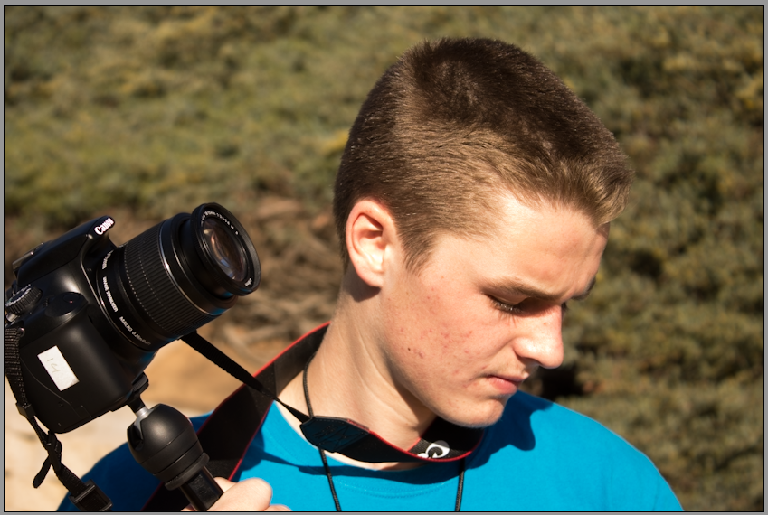
This is my portrait project final photo of Spencer Larsen. The settings were 1/400, 5.6 aperature, and 200 iso. Although the lighting was originally a bit too light, through editing in camera raw the lighting got back down to an acceptable level. The shadows on the lend to the idea that Spencer is in a deep thought thinking about his next camera shot.
1) I most liked that I could actually see myself wearing the t-shirt I designed and it wasn't something I didn't like. I also enjoyed working with a group to create a final product that we all had an influence on.
2) With more time I would fix that coloring so they match our school coloring better. 3) Although they force you to work faster, they make your final outcome more simple, which sometimes allows for a better final product. 4) What I like about working in photoshop is its very easy to translate ideas onto the template and make them look good. You're also able to alter the coloring and fonts fairly easily. This is the rough draft and final edit for the t-shirt design. I worked with Halley Atkinson, Ken McConnell, Ismael Pohlert.
Currently working on chapter 11, chapter 11 focuses on colors and lighting. Particularly balancing and correcting colors.
This photo by Erik Johansson represents seamless combination of multiple photos. The photo is a combination of 2 or 3 photos, the girl and the background is one where the dog with the leash is another, with the possibility of the balloons being a third picture. The reason this picture looks so real is because the leash in the woman's hand and the dog look there really there, even the dog floating tied to the balloons looks like it is actually floating. The background also captures a very beautiful landscape, that adds to the women and her dog.
In this project we were supposed to capture a silhouette and edit the photo to follow rule of thirds as well as display understanding of what a silhouette is. The lines within the photo emphasis the two men standing and the texture of the 3 different squares also lends to the emphasis on the men. The lack of detail in there body lends to a dark mood that the viewer receives from looking at the photo. The photo was originally colored but incredibly dark, with editing the color was transitioned into pure black and white then edited for greater emphasis on the dark in the people. This photo is a capture of penguins by Frans Lanting relaxing in the cold weather with their baby. Lanting uses rule of thirds to focus your attention on the penguins on the right by having them directly on the right axis. The photo also exhibits asymmetric balance, by having a group of three penguins grouped on the right side while on the left there are single penguins alone. The asymmetric balance also enhances the focus on the right sided penguins. Steve McCurry captures a fisherman in Russia doing an activity that would seem strange to Americans, but is part of everyday life in Russia. McCurry captures the fisherman as a silhoutee so the viewer focuses on the shape of the person instead of the features. The photo shows cool colors, giving a relaxing and ordinary feeling contrasting with the rough movement of the water.
This photo captures two hoopoes in a magnificent demonstration of silhouette photography. The picture is good silhouette because the background creates a good contrast to the black of the hoopoe and the branch. The color of the feathers on the hoopoe also focus in the attention of the viewer because they're the only part of the hoopoe that is colored. The photo also contains extremely warm colors with the vibrant orange of the background.
|
This is my blog page if you want to look at reflections on my photos or others you're in the right place. But you can also check out my about page or my portfolio for stuff about me.
|